
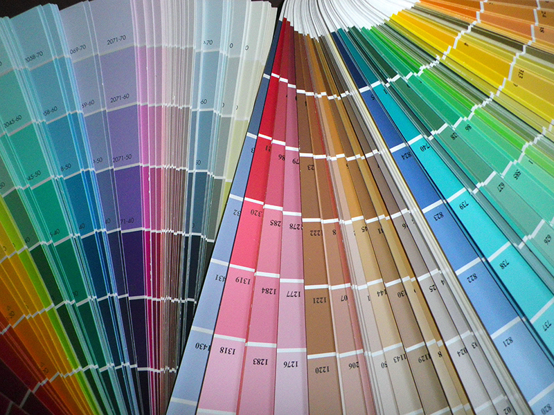
See trauma-informed color palettes that align with cultures around the world:
Outlined regions are still in progress.
Colors elicit an emotional response, and while there are variations in how different people and different cultures experience colors, there are a few trauma-informed design principles that hold up across cultures.
One is that using a soft oatmeal or very light tan instead of a bright white can keep a design from being startling or jarring to a nervous system. Another is to use contrasting colors for all text so a design stays legible and easy to scan. And while using variations of one color can be soothing, it's important to have a contrasting color to show where action should be taken. I like to think of this as a motivating color. Colors used in motivational design are typically warm ones (reds, oranges, yellows), but in trauma-informed design an action-oriented color only needs to contrast — it doesn't have to be warm.
An action-oriented works best when it contrasts with your palette, it doesn't have to be a warm color.
Saturation is more important than hue
Of course, one person's calming color is another person's annoyance. In practice, the level of saturation matters more than the choice of hue. A muted coral and a muted teal will have a similar effect on a page. A fully saturated version of either one can communicate a boldness that a startled system reads as urgency.
One hue from gray to FULL SATURATION
#858585Neutral gray
0.042#9A7B87Barely there
0.085#AD6F89Quiet accent
0.127#BE628BThe source color
0.170#CE518DConfident
0.212#DD398FMotivating
0.255#EB0091Urgent, sRGB limit
More gray (or taupe) added to a color provides a muted version better suited to trauma-informed design. Saturation, however, is only half of it. The other control is lightness which runs the same hue from nearly white to nearly black. The lighter versions of a color work best for backgrounds, mid and medium-dark versions work well for accent and action colors, and the darkest version can be used for headline or body text.
Try my Trauma-Informed Color Palette Builder.
The same hue, light to dark
#FFE8F0Page background
84%#FFAFD0Section fill
73%#E484ADBorders, rules
62%#BE628BThe source color
50%#99416AButtons, links
39%#751F4BHeadings
28%#50002DBody text
I've developed trauma-informed color palettes for different regions of the world using this system: a neutral light color, a neutral dark color, 4 nature- or culturally-inspired colors, and an action-oriented color.
Building Regional Palettes
Looking beyond the natural landscape of each region, societies assign meaning to colors based on regional color systems, religions, folklore, philosophy, and history. For each region, I've noted which color system is commonly used, how I included cultural colors with regional significance, then identified each palette by one of these 8 descriptive words: Clarifying, Grounding, Motivating, Nurturing, Refreshing, Regulating, Sheltering, Uplifting. These are subjective and arbitrary; I hope to refine these through research later.
As a final note, trauma-informed design is most often discussed using words like calming, soothing, grounding, and trustworthy, but brighter, more motivating color palettes are sometimes appropriate for audiences whose trauma has caused deep disconnection and depression. In those cases, colors that inspire hope and optimism can be useful.
See trauma-informed color palettes that align with cultures around the world:
Outlined regions are still in progress.